As the business was striving to change existing brand perceptions, Crowley realized that its previous brand identity and positioning was outdated. It didn’t reflect the transformations the brand had undergone in its lifetime or the importance of Crowley as powering the lifelines of the world.
By shifting towards becoming a more sustainable and socially responsible business, Crowley had the unique opportunity to strengthen its position in the market as a company that can balance today’s interests and tomorrow’s challenges.
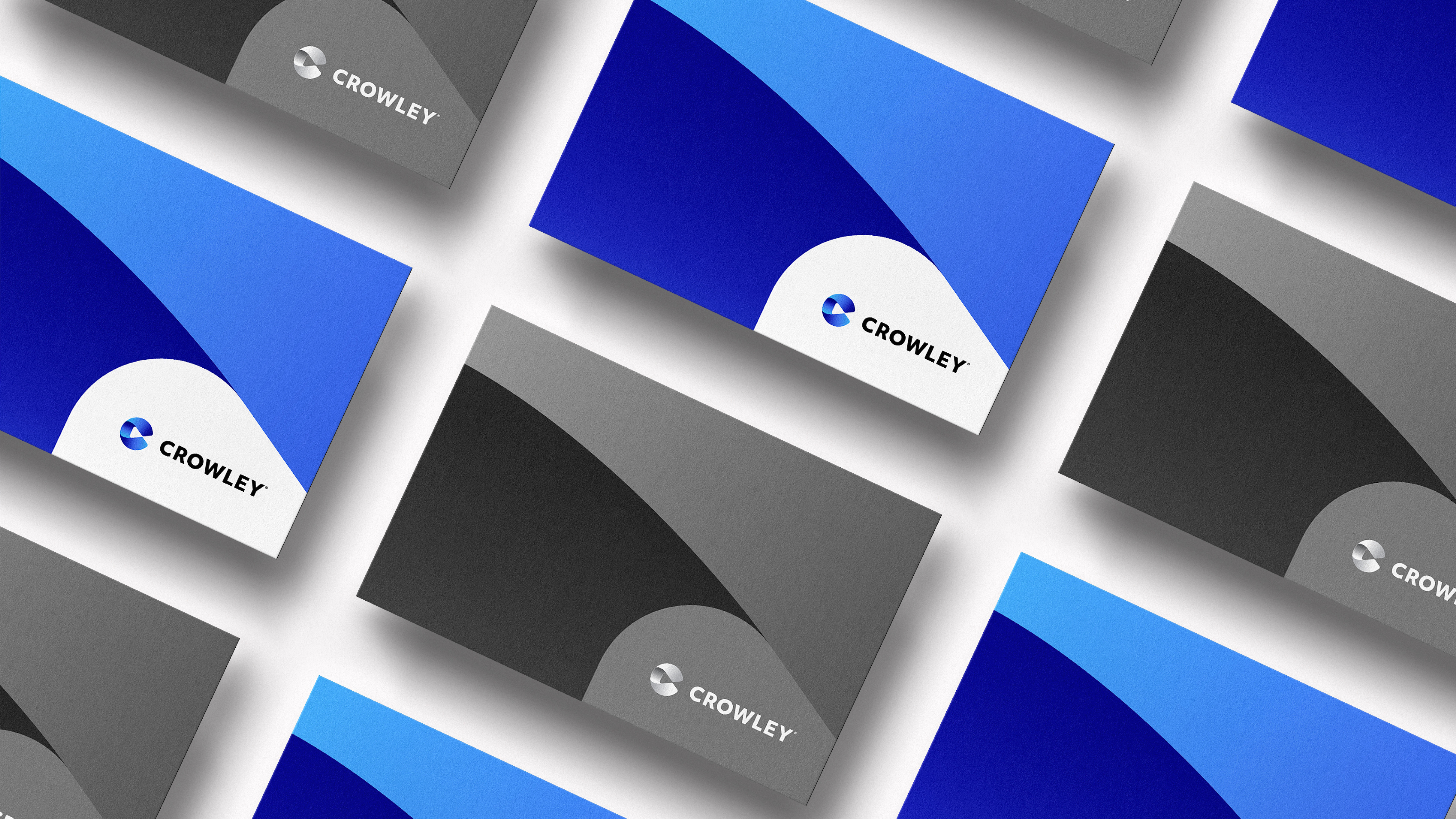
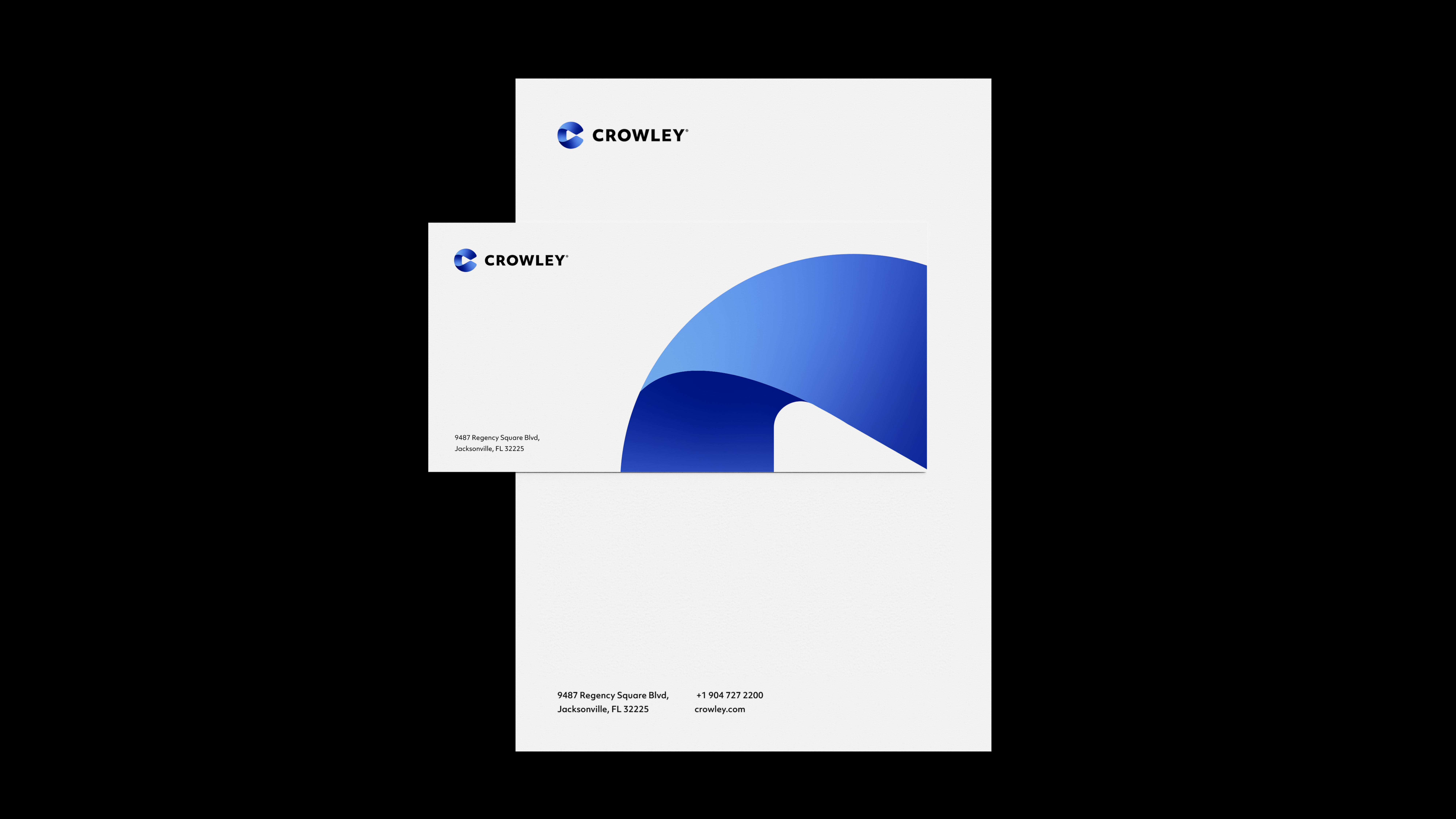
Quietly powering from behind the scenes, Crowley is a company leading with purpose. Having identified the need for digital and brand transformation, we were tasked to create a bold brand identity that not only showcases the full expertise of Crowley, but guides them on their roadmap to the future.
Services:
Brand Identity
Completed at FutureBrand, NY
Team:
Daniel Andersson
Kristopher Pelletier
Emily Hartnett
Chad Thomas
Aarif Morbi
Clare Louise Smith
John Binder
Client:
Crowley
Daniel Andersson
Kristopher Pelletier
Emily Hartnett
Chad Thomas
Aarif Morbi
Clare Louise Smith
John Binder
Client:


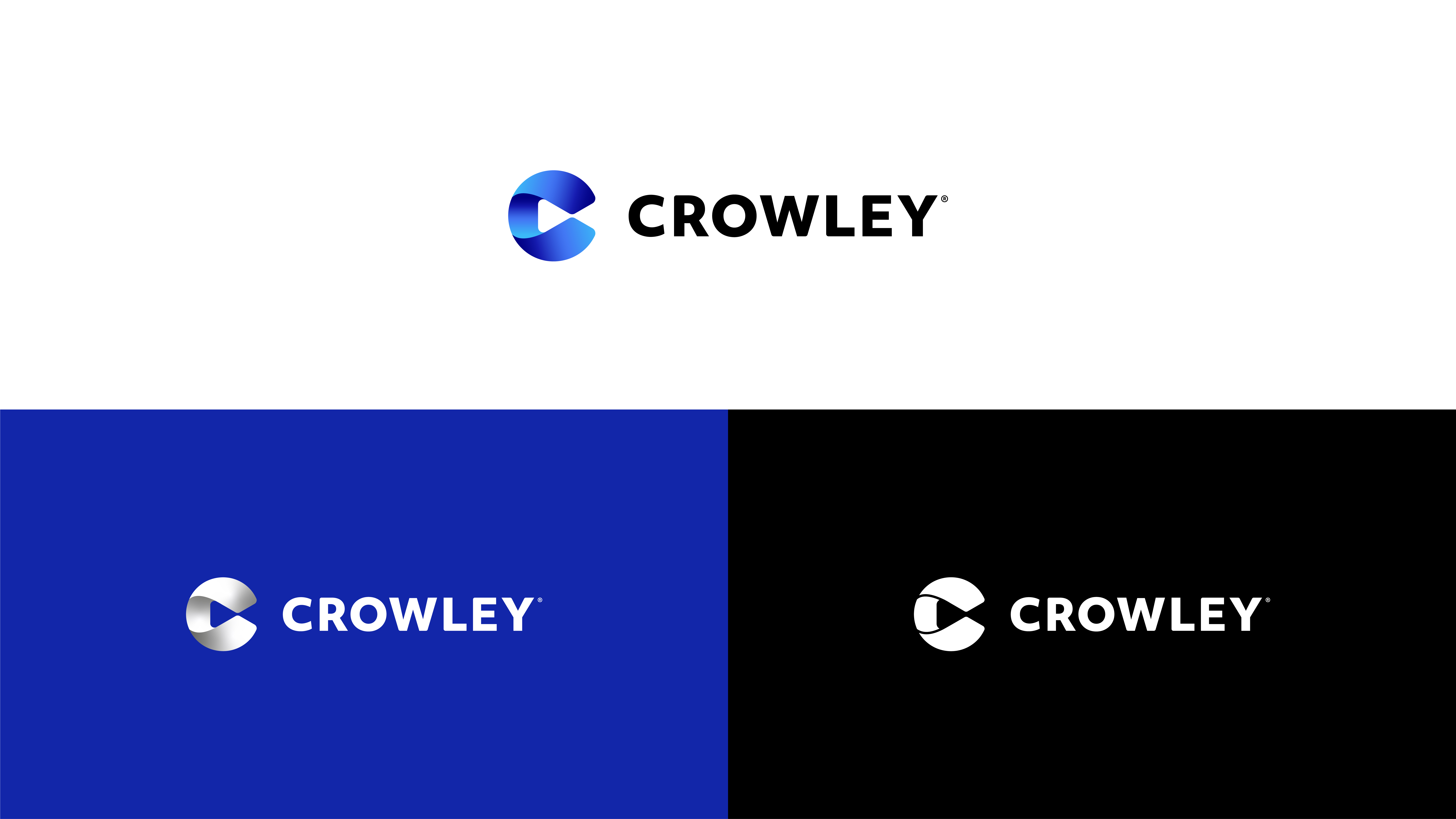
Like many elements of Crowley brand, movement is quite literally at the core of the new logo. Contained within the Crowley C symbol is an arrow, which subtly signals progress and forward motion. This is driven home by the surrounding C, whose gradient conveys both an intentionality and a fluidity that are key in the solutions we deliver to all Crowley’s partners.
The distinct blue hues of the C represent their maritime origins, technologically savvy future, and the stability and reliability that are imbued in all Crowley do.


